Prague Escorts18+
Platform overview
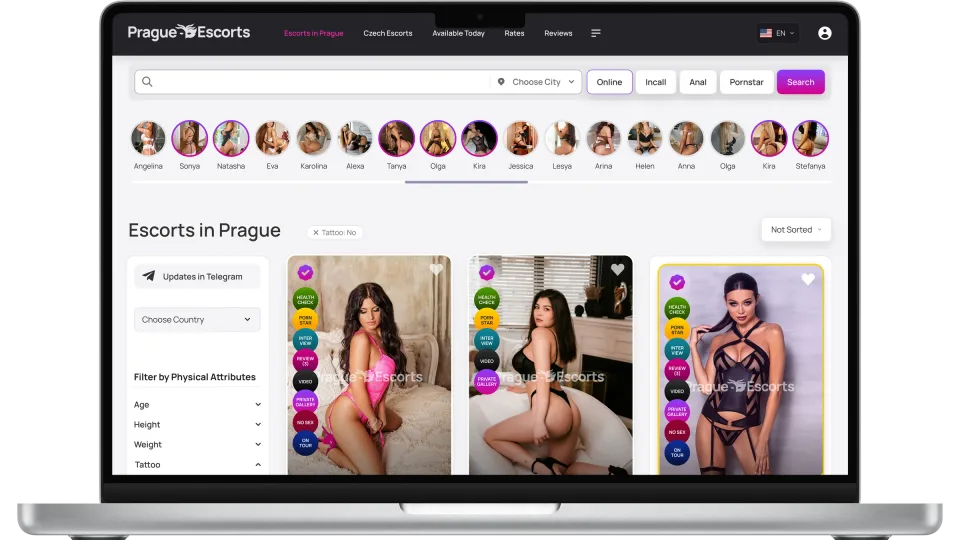
I mapped every flow — listing, profiles, agency, auth, and the edge states — in Figma before writing any code. The point wasn't to draw screens; it was to design the system that screens come from, so each page became an assembly of known parts instead of a fresh set of decisions.
Context
An adult directory running on a Laravel backend I couldn't replace — so the redesign had to slot onto existing routes and data, not fight them. I owned it end to end: UX flows in Figma, a token layer in the middle, production Blade + Alpine.js on top. One person, one system, so design intent survived all the way into the codebase.
Problem & brief
The legacy UI was a template patchwork — cards, spacing, and type re-decided per page across 14+ routes, so nothing read as one product and every fix leaked new regressions. I made a deliberate call: stop shipping pages, build the component library first. Filters and agency tooling had no shared foundation to stand on. Slower to start, far cheaper after the first few screens.
Before / after
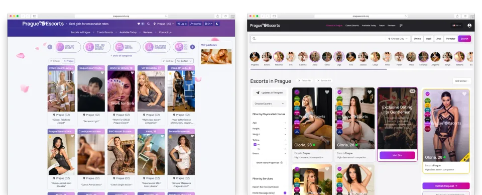
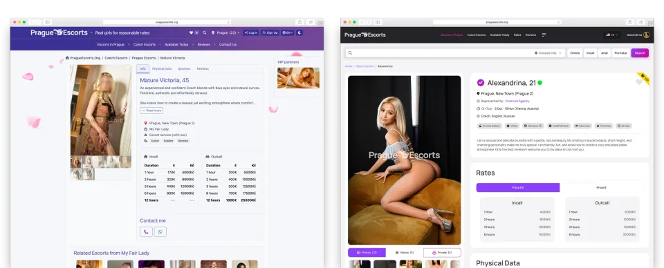
Same routes, same crops — only the system changed. I kept the comparison honest so the story is about UI structure and hierarchy, not flattering angles: the legacy side is the cost of per-page decisions, the redesign is what one card component and a single spacing scale actually buy you.
Design system
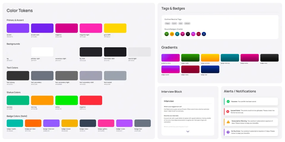
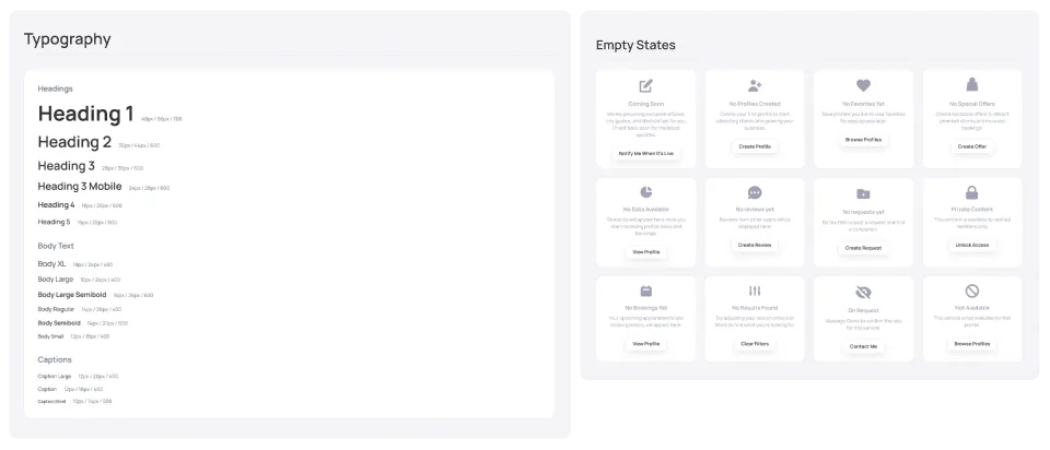
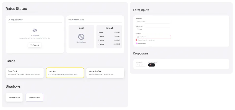
This is the actual product — every screen is just an instance of it. I treated tokens as the single source of truth for color, type, surfaces, and status, so a change propagates everywhere instead of being re-typed per page, and documented it as a live showcase rather than a static sheet so design and build read from the same reference. 100+ tokens, 55+ components — including the empty and error states most directories only discover at launch.
Key screens
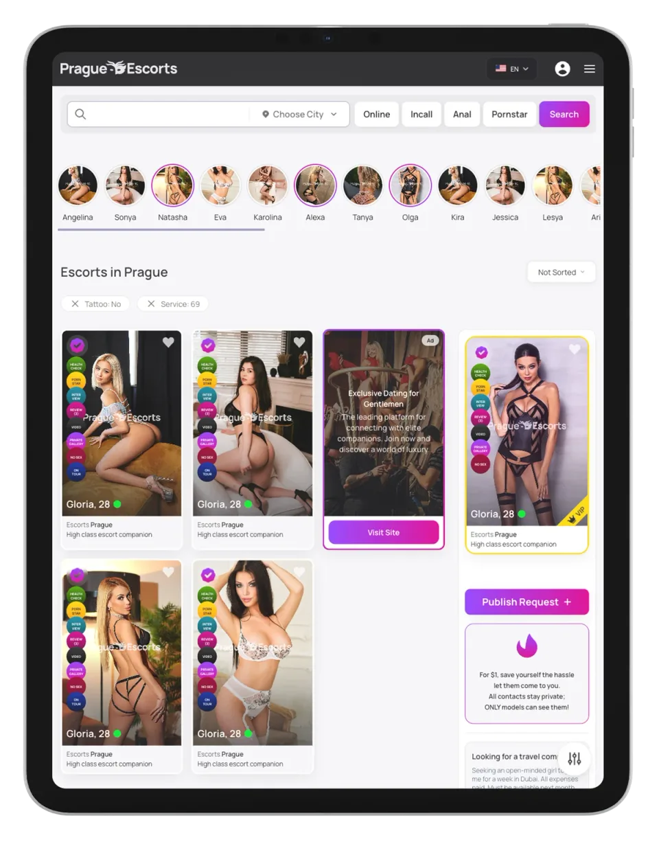
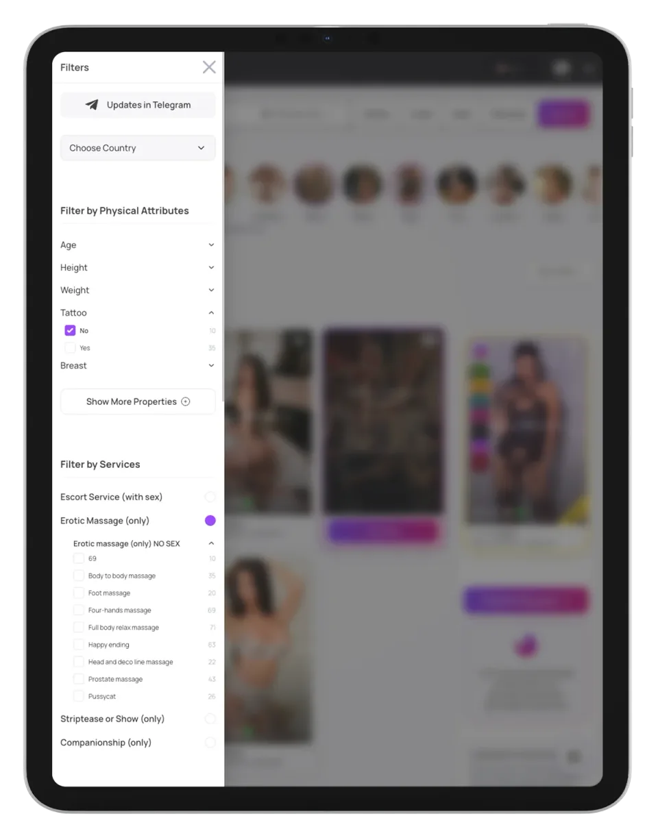
Listing is where users actually spend their time, so the filtering had to be powerful without spawning a second, mobile-only build to maintain. I designed one card grid and one filter panel that simply reflow, and let Alpine.js toggle that panel into a drawer at narrow widths — same markup, same components, no parallel UI to keep in sync.
Model profile
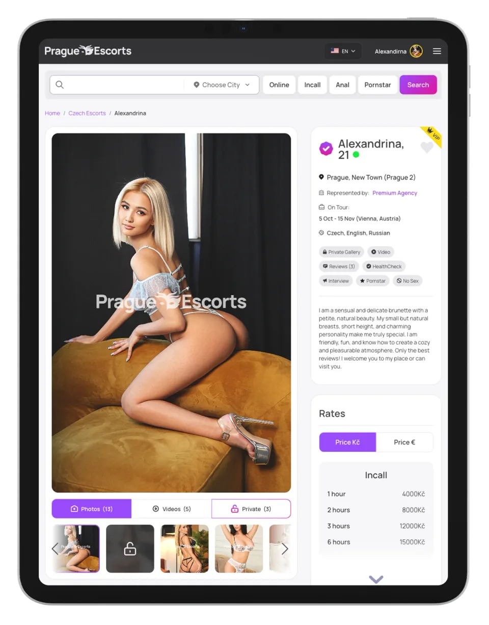
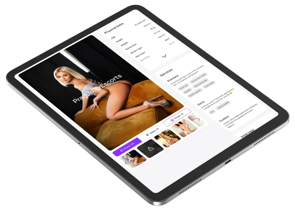
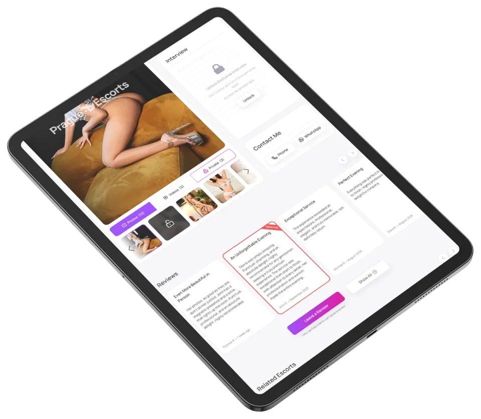
A profile is dense — gallery, stats, services, reviews, contact — so the risk is a wall of data. I anchored a sticky media column beside the scrollable content, keeping the photos and key actions in view while the details scroll, and built every block from the same library as listing so a returning user already knows how to read it.
Agency profile
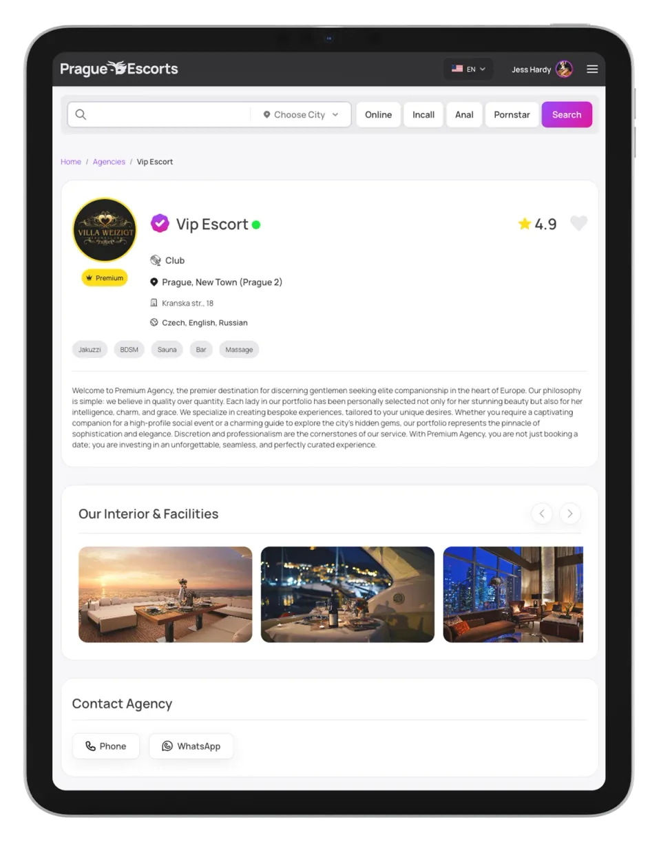
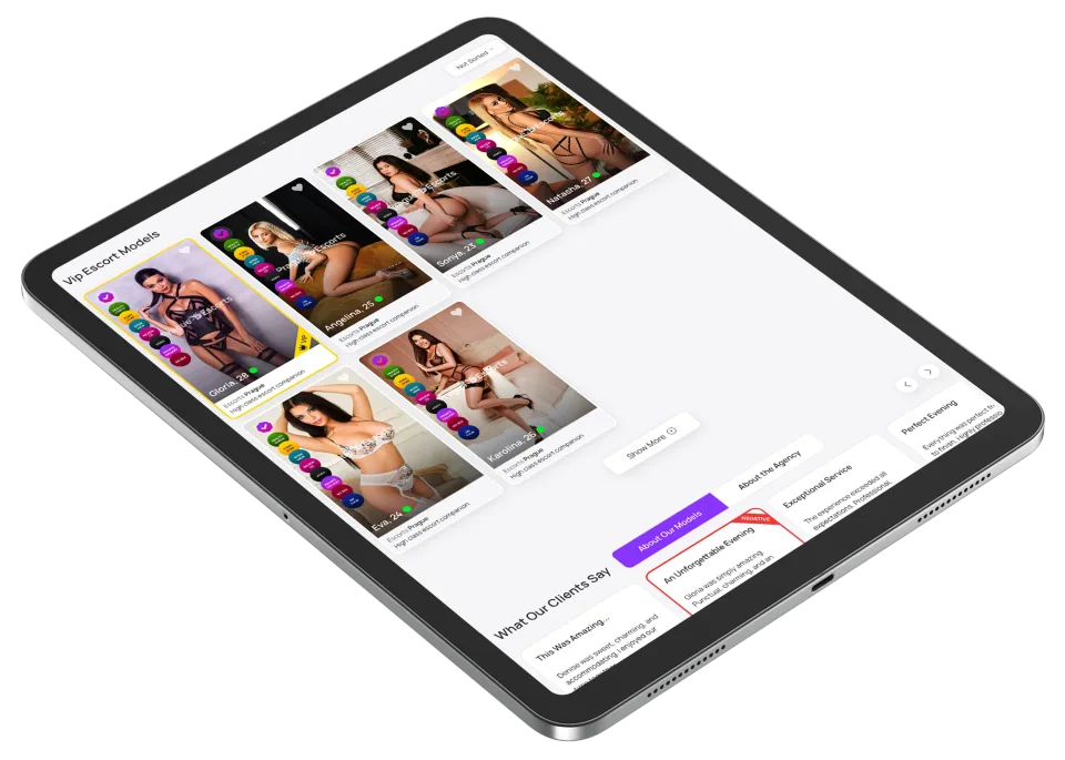
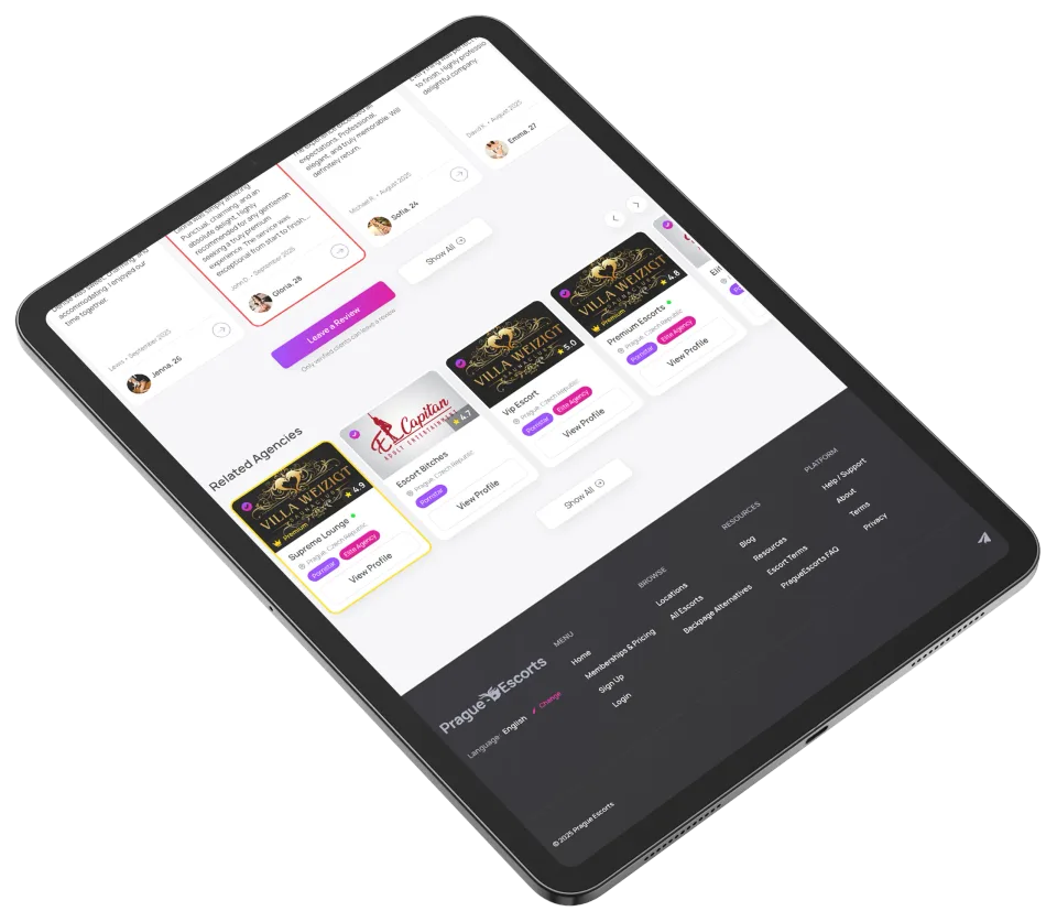
Agencies needed their own hub, but inventing a separate visual language would have fractured the product. So an agency page is deliberately the model profile's bigger sibling — same cards, same type, same review pattern — with a roster that simply reuses the directory grid. New surface, zero new components to maintain.
Hot offers
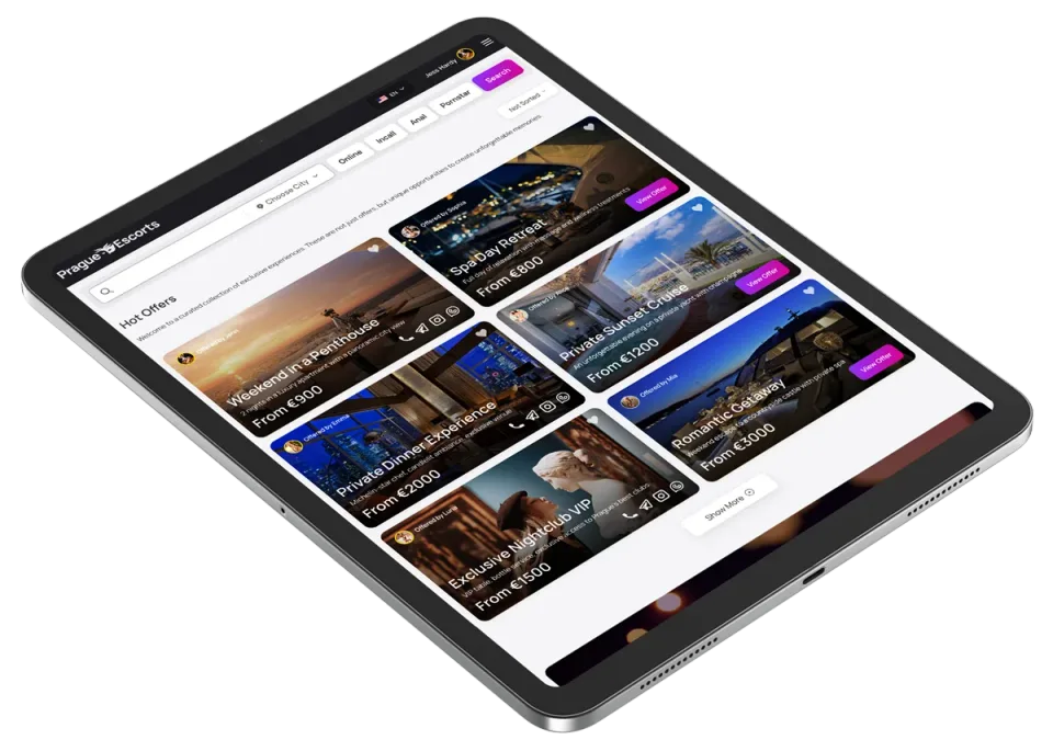
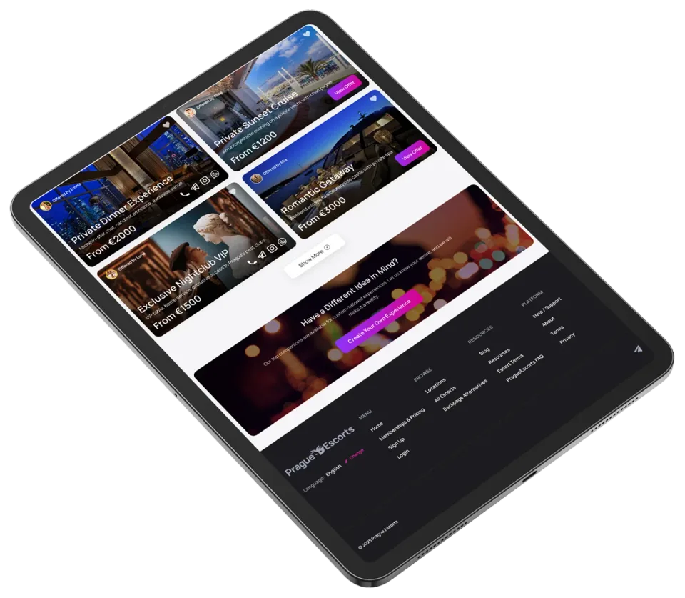
Hot offers is a commercial surface, so it had to feel premium without becoming a one-off to maintain. I reused the directory's card and filter system and pushed the difference into content — richer hero cards, pricing, and a 'create your own' CTA — proving the same components flex from a plain listing into a marketing page.
Auth
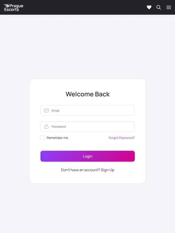
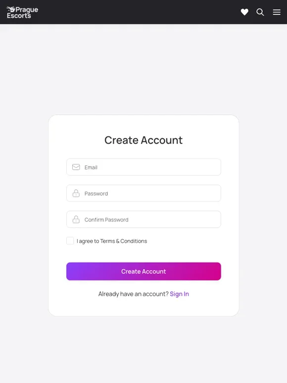
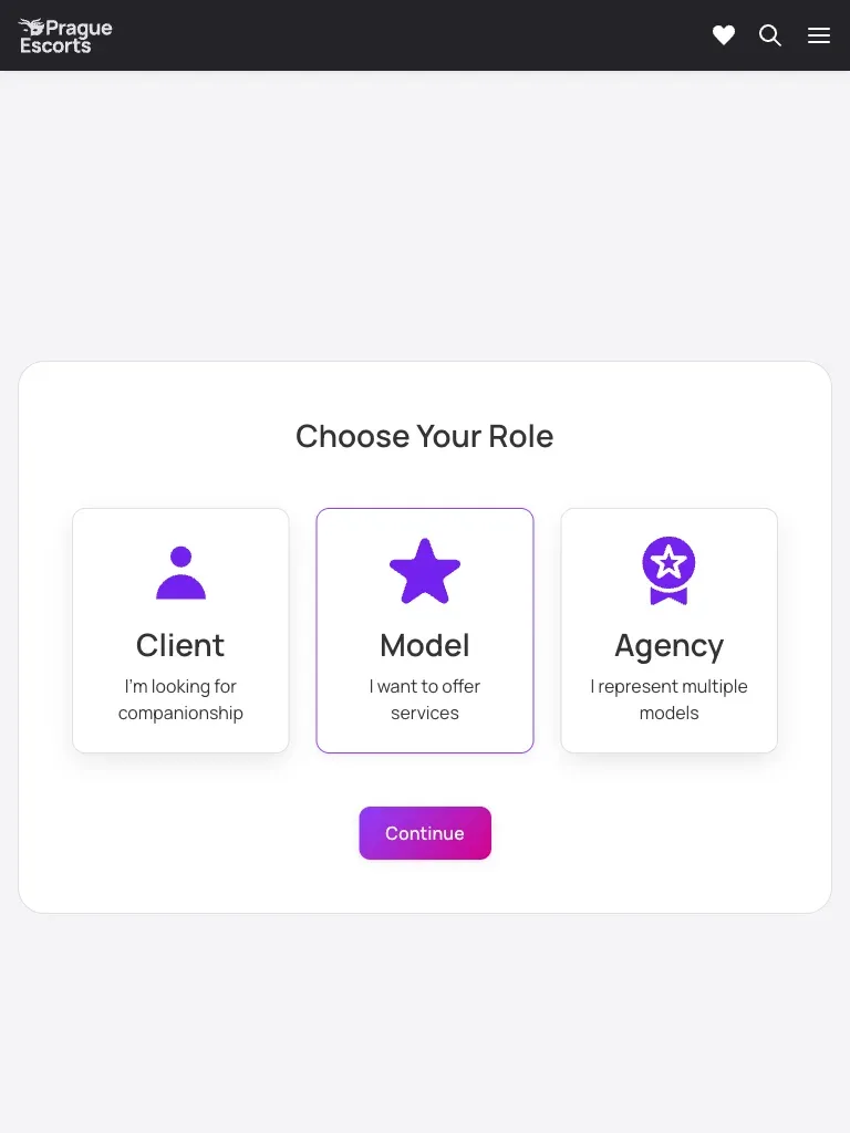
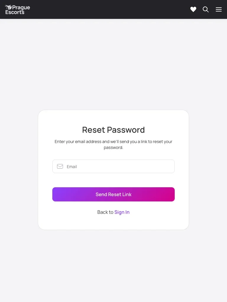
Auth is the first real interaction, and friction here costs signups directly. I built it from one set of form components with inline validation and a single gradient primary action, and split onboarding by role — client, model, or agency — up front, because each path is genuinely different and guessing later is worse than asking once.
States
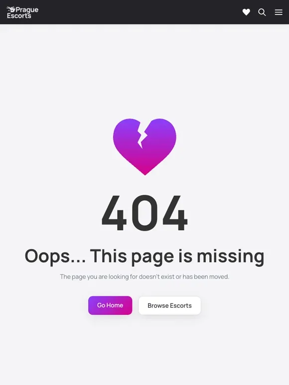
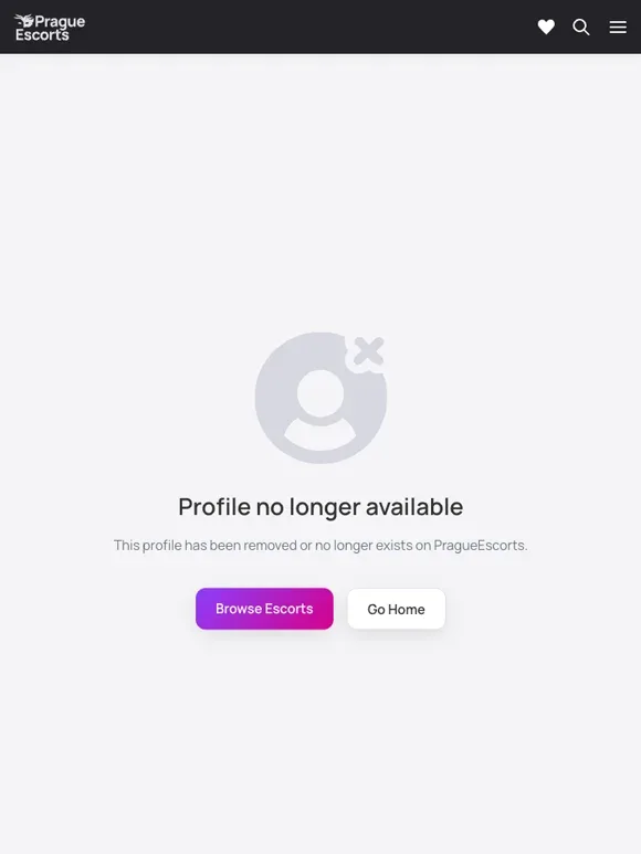
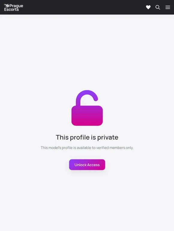
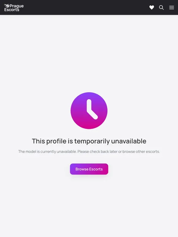
Edge states are where directories usually feel broken — a removed model, a private gallery, a dead link. I treated them as first-class screens, not afterthoughts: each uses the same empty-state pattern from the system, says what happened in plain copy, and always offers a route back into the catalog instead of a dead end.
Create request & paywall
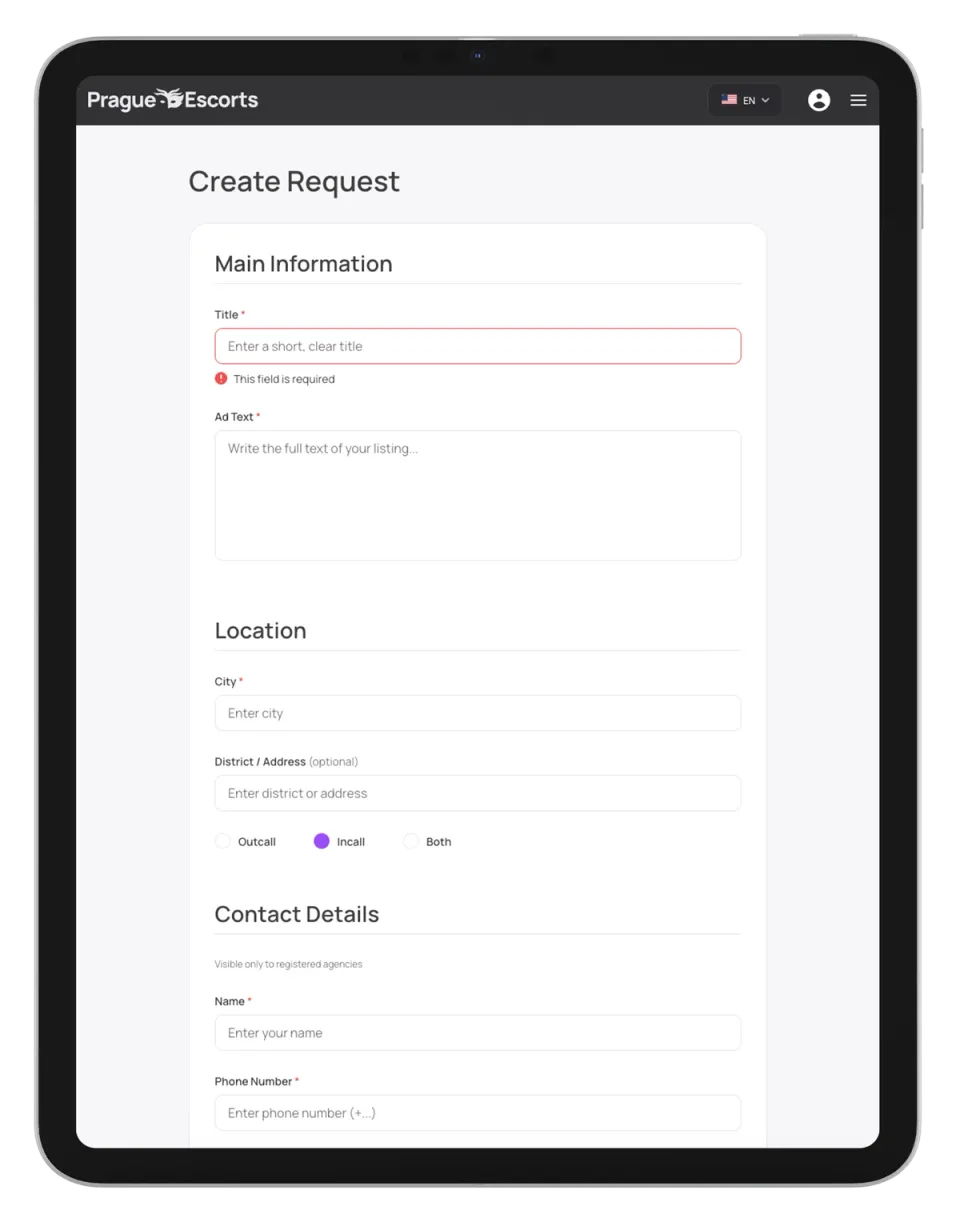
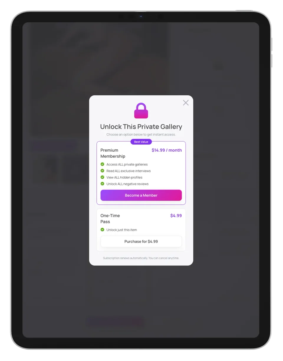
This is where the product makes money, so both flows had to convert without feeling cheap. The create-request form is chunked into sections with inline validation so a long form never reads as one, and the paywall is a focused modal weighing membership against a one-time pass — both built from the same cards and buttons as the rest of the site, so monetization feels like part of the product rather than a bolted-on upsell.
Mobile
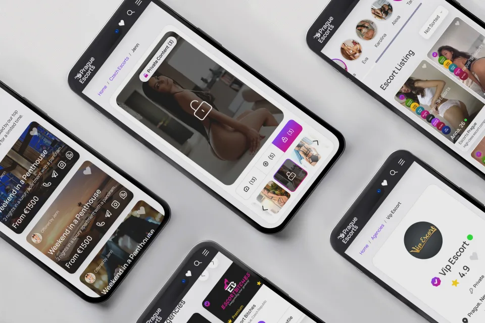
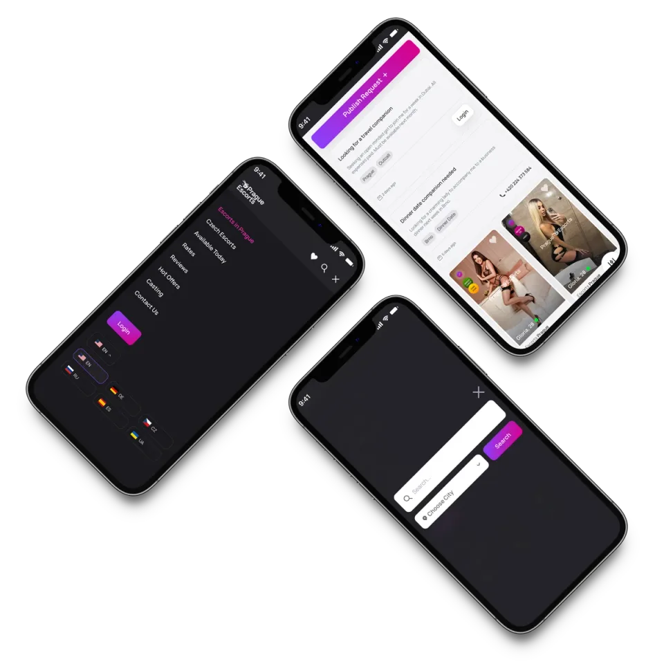
There's no separate mobile site — and that's the point. Every phone layout falls out of the same tokens and components as tablet and desktop, so there's no parallel CSS to drift out of sync. The real work was deciding what collapses, stacks, or hides at each breakpoint — not rebuilding screens.
Dev handoff
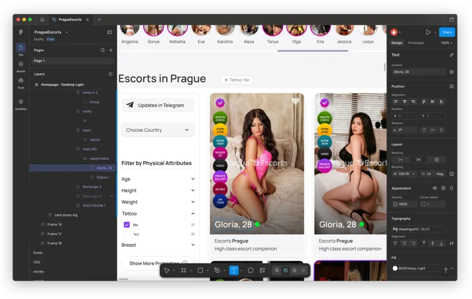
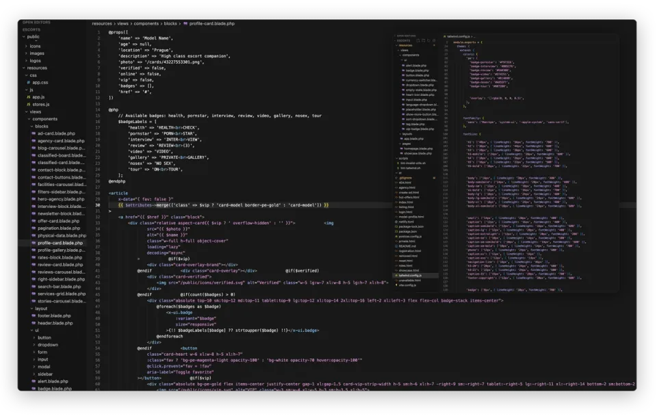
Because I designed and built it, handoff is a straight line, not a translation. A Figma card's spec — type at H3 28/36, the exact color token — lands as a profile-card Blade partial using the same pe.* tokens defined in tailwind.config.js. Design and code share one vocabulary, so there's nothing to interpret and nothing to drift.
Platform breadth
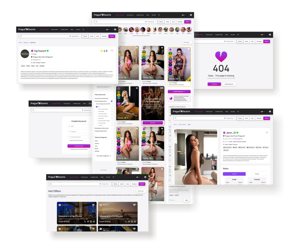
Zoomed out, the proof is the consistency: listing, profile, agency, auth, and states all read as one product because they're literally built from the same parts. This is the payoff of systemizing first — breadth without the entropy that sank the legacy UI.
Brand touchpoints
The system doesn't stop at the screen. I drew the wordmark and merch in Illustrator from the same palette and geometry as the UI, so the brand and the product feel like one decision instead of two.